How to make your website visitors feel welcome
A recent visit to a hotel left me confused. I didn’t know whether I was in the right place – I couldn’t make out whether it was actually a hotel or a conference centre. There was no reception desk or concierge and there were few signs to direct me, so I made a swift exit.
In contrast, Husband and I stayed at a lovely hotel in Belgium. The reception was spacious, sophisticated, clearly signposted and the concierge was friendly and welcoming. They even offered us some coffee and Hors oeuvre upon arrival. We were impressed!
Why am I telling you this? Because your home page is the entranceway to all the wonderful things that your website is offering so it should be impressive. Don’t be that first hotel.
Your homepage is about more than just a few words and a few pictures. It has an important job to do. Just like the Belgian hotel, your homepage should be welcoming, with lovely décor (good design), clear signage and a friendly concierge (clear and welcoming copy) and clear directions to your room (the product or service you need).
So, what’s important to include in the homepage?
Your design
Grab their attention without being overbearing. Well-designed websites are no longer about standing out through busy design, bold colour and all-singing-and-dancing graphics. There’s no need for bells and whistles, that just confuses the eye and sends readers off in a panic. To stand out these days you need to use the less-is-more approach, using design that it easy on the eye. By all means, express your creative side, but be subtle and delicate. You want a refreshing quality to your home page – some calming, soothing design with simple creative appeal.
Your brand
Like the grand desk of a 5-star concierge, the logo for your company should be represented clearly but not too overpowering. It should include a tagline that gets to the heart of your mission.
Your words
Ensure that you don’t put people off by overwhelming them with words (that’s what blogs are for) or being enigmatic with too little direction. Just like Goldilocks, your website homepage should be “just right” because you don’t have long to make a good impression and you’ve a lot of information to put across.
Your navigation
Page layout and navigability is crucial to the success of your site. And the home page is the signpost that gets readers to where they want to go, with ease. The main navigation area should be prominent – next to the main body of the page or directly underneath it, for example. And group similar navigation items together.
Your connection
Include links to your social media accounts on your homepage if you want to expand your web presence. Sharing icons to your Facebook, Twitter, LinkedIn, Instagram, at the footer of your homepage will allow your audience to share your site’s content easily.
Your website homepage is usually the first page customers come to when they click through to your site; it’s the first impression that you give to your readers. And they need to feel comfortable, be impressed and stay a while to browse. Create something that not only attracts visitors but settles them down for a nice cuppa and some Hors d’oeuvre, before they go to their room, (or browse your website with the intention to buy).
Image courtesy of Pixabay
SEO Affiliate Domination interview with Greg Jeffries
Ben has always been fascinated by the seemly unending ways people can make money from the simplest things, and affiliate marketing is one of them.
So in this interview he spoke with Greg Jeffries who has a ton of experience in this area and shares some of the ways he uses SEO to generate income.
- Affiliate Marketing – what is it?
- Greg Jeffries
- Affiliate Marketing for Beginners
- How To Succeed With Affiliate Marketing
- Product review surveys
- clickfunnel
- Domination course
Image Credit: Headshot image courtesy of Greg Jeffries and Idyllic Beach and Boat scene by Pexels
Invest in the seeds of your evergreen marketing
It is easy to get bogged down into the constant struggle of reeling in profitable business. And in a tight economy, it’s understandable why we might tighten our belt and trim off the frills. But it’s worth remembering that marketing is one of the key strategies for getting in that new business and building the foundations for eventual sales.
Obviously you need to be sensible, so think about your evergreen marketing; by evergreen marketing I am talking about a marketing idea or concept that will last beyond the next couple of hours, weeks or even years, perennially providing you with new strands of business.
The top four evergreen strategies I would recommend investing in are:
Video
One of the top marketing tools to give your customers value or deliver a personal touch, I cannot express how much I value video. Working around the clock on platforms like Vimeo, YouTube you are able to hook business from worldwide markets.
Whether it is a how to guide, vlog, casestudy, testimonial or product overview it will certainly benefit your business. It doesn’t have to be overly complicated, less is always more and you may even be surprised at how affordable it is.
If you don’t have the capacity to create a short video, think about making a slideshow animation from images or using animated GIFS to help catch your audience’s eye.
Website Facelift
In a world of instant gratification and with many of us carrying a computer in our pockets it seems ludicrous if you do not have an online presence. A handful of pages is better than nothing. The absolute basics should be a clear message about who you are, what you can deliver and how to get in touch with you. This is often the first glimpse into your business so make the effort and make sure it gives a professional vibe.
With current online web design sites such as Squarespace or WordPress their really is no excuse. Even hiring a professional web designer is a reasonable cost for most busineses. Giving your site a facelift does not have to be expensive and often needs just a review of the text, images and search optimisation.
Don’t have a website? At the very least make sure you have an online presence using a Facebook Business page or Google My Business profile. How else will your customer’s find you?
Blogging
Informative and educational articles is where you will capture today’s audience. If we want to know something we ask Google.. delving into a world where at a click of a button we can find out how to fix our washing machine or learn how to perfect a certain recipe.
Whether it’s an informative article or a more informal account of what is happening in your business. The more information you share online through articles on your site, the more this will help capture your audience. By writing and sharing something of true value you are instinctively building trust with your customer by proving that you know what you are talking about. Sharing helpful tips and tricks will make you more memorable and possibly prompt a return visit or even a recommendation.
It will also help boost your website up the Google ranks as the search engine robots favour sites with quality and relavent content as it increases the amount of time that is spent on the site, reduces the bounce rate and increases the number of pages visited per session.
Don’t forget all of the content you are gathering could be translated into a video at a later date!
Case studies
You can huff and puff until the cows go home but nobody can sell your business more than your previous clients. When investing in a new venture or purchase the majority of people these days will search online and read the reviews to help them determine which company they would like to go with. If you are good at what you do, be open. Contact your previous customers and ask them if they would mind giving you a review or sharing some feedback. You never know you might find that you learn something from the feedback which could streamline your business further. Whether it is a short statement, written or filmed interview it will add an extra layer of authenticity whilst reminding them that you still exist and could even prompt further work.
It is important to be careful about what you invest in but don’t be afraid to invest in marketing ideas that are fun or novel as often that is the stuff that hooks in your audience. We are all bored and numb to so many of the mainstream marketing campaigns so think of how you can be different and about what your customers would find helpful.
Image credit: Adrenalin by Artem Bali from Pexels
3 reasons your website is repelling your customers
You go to your local town to do some shopping. One shop entices you with its window display, and you head for the entrance. Only to find that the door is jammed, and you can’t get in. You can see people in the shop, but no matter how much you try you cannot access that store. Eventually, someone comes to the door and mouths through the glass that the shop is closed. You come back the next day and the situation hasn’t changed. Would you be frustrated? Would you shun that shop forever more and go somewhere else?
So why would you think that your website is any different? You may be proud of your new site, with its branding and its colours, even its poetic and whimsical copy. But does it actually work?
Your website is the face of your company, and you don’t want to give the wrong first impression. Perhaps one of the buttons lead to an error page, maybe the images don’t load, or worse – the website displays that annoying 404 message. There is just too much competition for your customers to turn to, so don’t give them a reason to go.
So, what are the 3 main reasons you could be sending your customers to your competitors?
Inadequate mobile optimisation
In 2017 mobile shopping became the most popular method of shopping for consumers with research from the Consumer Technology Association (CTA), showing that smartphones were the devices most used by consumers for online shopping, at 41%, during the 2017 Black Friday weekend. And this trend is set to rise with a research report from OC&C Strategy Consultants, Google and PayPal forecasting that around two-thirds of online retail in the UK will be via mobile by 2020.
It’s important for the survival of your business that you adopt a mobile-first mentality. This means, at the very least, checking that your website is optimised for mobile use but ideally ensuring that your visitors’ experience of your site is as good from their mobile as from a desk or laptop.
If your website is not mobile responsive and doesn’t proportionally resize to different size screens or you don’t have a mobile version of your site, that’s not going to go down well with those customers who shop from their mobile. Indeed, statistics show that 40% of users will click over to another website if they are not satisfied with their mobile experience or have difficulty completing a mobile transaction.
Slow website speed
I remember the days of dial-up. Minute upon painful minute of waiting to access the internet. These days everyone is impatient, and most of us won’t wait even 2 seconds for website content to load. And a study by Kissmetrics shows that 40% of us will abandon a site entirely if it takes longer than 3 seconds.
But it’s not just our impatience that is driving this behaviour. A fast website is the sign of a professional and reliable enterprise and having to wait longer than 10 seconds means a site is unworthy of our attention. We relate speed of loading to efficiency, trust, and confidence. But, we relate having to wait with incompetence, insecurity, and to a lack of credibility. The impact of this can be catastrophic for your business. And there is proof in that pudding with some of the biggest companies testing this out. Amazon’s tests showed that if they slowed down by just one second, they would lose $1.6 Billion every year.
Find out why your website is taking its sweet time. For example, slow-to-load mobile pages could be the result of a large number of javascript files and plugins. Image file sizes could affect it too. Look into it and fix it or find someone who can. The impact on your business is just too drastic to leave it to sort itself out.
Test the speed of you website on Pingdom, you should be aiming for under 2 seconds.
Poor User eXperience (UX)
We expect a seamless experience when visiting a website. It has become a basic requirement across all platforms and devices, and a site that doesn’t conform to this standard doesn’t stand a chance.
If your website delivers good content and clear conversion opportunities you are maximising your chances of conversion – a recent study from Forrester Research showed that a user-friendly website could raise your conversion rate by up to a 200%.
If, however, you are trying to entice with over-the-top, eye-catching trashy content and/or inundating your visitors with newsletter sign-ups and in-your-face ads, you’re simply going to annoy more people than you attract.
Instead, avoid the garbage. Make the buttons tap-friendly by making sure all buttons, links and calls to action have the appropriate size and margin to prevent errors. Ensure users can tap-to-call. Use infographics and videos rather than reams of text to relay your message. Make it easy for users to navigate, read and tap on menu items.
You need to know your site works, and that all the functions work as designed, and you also need to make it easy for users to navigate and use your website. Otherwise, you might be inadvertently encouraging your customers to go elsewhere.
Your website is the way people buy your product or service, and this is becoming increasingly the case with more sales happening online than ever before. You have only seconds to influence your visitors so ensure that they are accessing a high-speed website, optimised for mobile use and that they are presented with an excellent user experience.
Make sure your customers don’t have to struggle to access or find your products or services, because with the highly competitive nature of eCommerce, your customers will not hesitate to go elsewhere if even the slightest headache arises, and this comes at a considerable cost to your business.
Image courtesy of Pixabay
Our Five Favourite Web Chat Apps
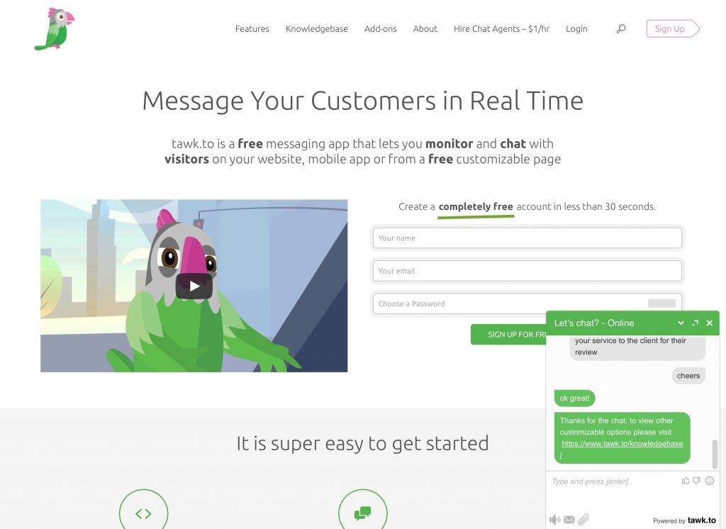
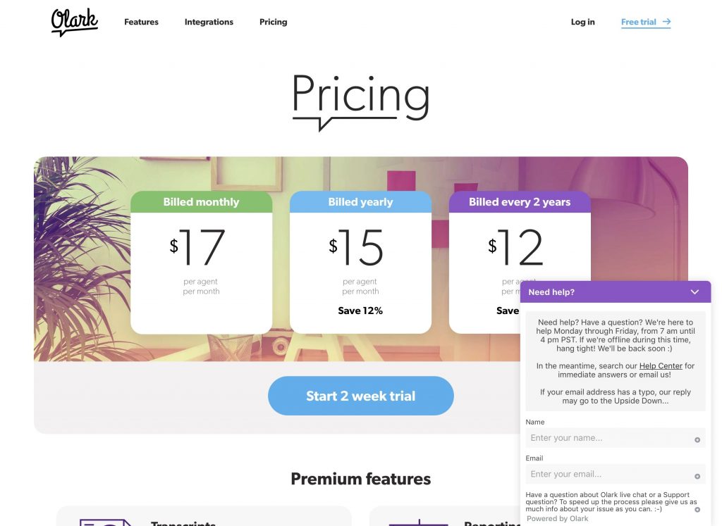
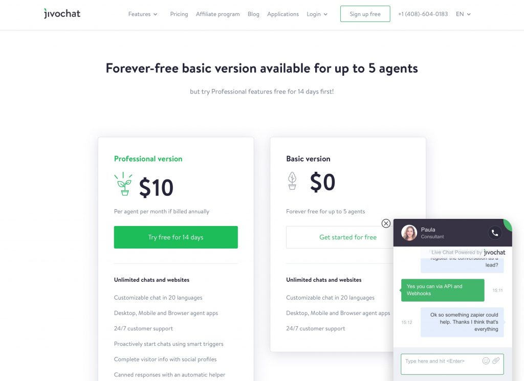
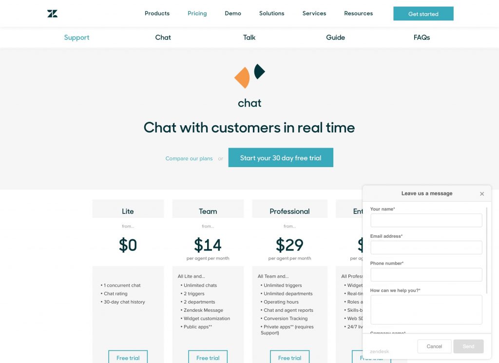
A client recently asked for our recommendation on which website chat app to use and as I’ve only have experience with Olark in recent years I thought it would be worth reviewing what’s currently available.
I picked five listed below based on whether they were recommended elsewhere, if I’d heard of them before or on the clarity of the offer and the systems design. I evaluated each chat app as a potential customer chatting to the vendor’s operator judging each on how quickly I got chatting, if I was hounded at all to begin with, what integrations they had and of course the cost. Hopefully this will give you a little more information to refine down your selection to test out.
Summary: JivoChat and Olark stuck out for me as a cost effective way to get started but Zendesk looks like a good step up to a fuller chat and customer support system with better integrations when time and budget allow.
Tawk.to
- Chat only. Free with option to pay for branding removal or chat agents
- Need to enter email/name to start chat
- Admin is browser only as far as I can see
Olark
- Chat only from £12/mo/agent but have free plan capped at 20 chats/month
- Automated messages to start conversations based on rules such as referring URL or location
- Message templates for quicker responses
- Integrates with many CRM apps
- Needed to enter email/name to start chat
- Exit survey and ability to send copy of the transcript by email
JivoChat
https://www.jivochat.com/pricing/
- Basic version free for 5 agents. Pro version (£7/mo/agent) includes canned responses with some automation message automation
- No questions to start the chat, was initiated by operator
- Have desktop and mobile apps as well as browser app
- Have API/Webhooks
- Simple exit survey to capture sentiment (thumbs up or down)
Zendesk
https://www.zendesk.co.uk/product/pricing/
- Chat from £12/mo/agent
- Email software £5/mo/agent. Includes basic Knowledge base/FAQ system
- Optional Answer bot from £38/mo/50 queries
- Chat box doesn’t pop up automatically. Not able to test out the chat feature
- Mobile and browser apps from what I can see
- Have API/Webhooks
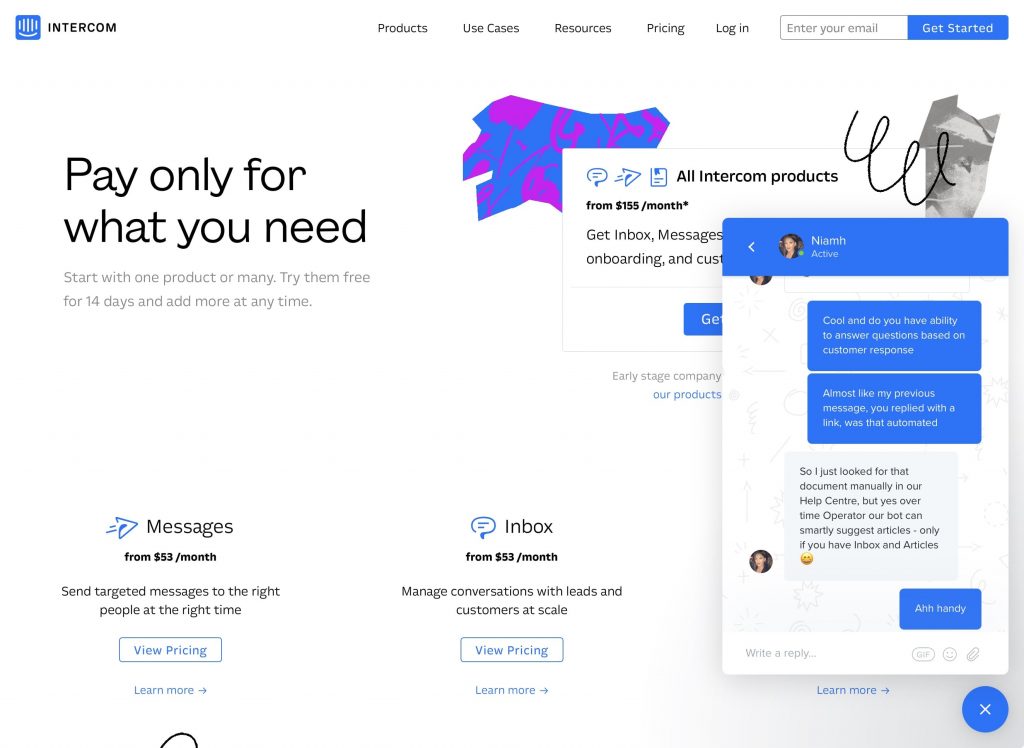
Intercom
https://www.intercom.com/pricing
- Chat from £38/mo unified comms inbox to manage chats. Can also manage social (Twitter/Facebook) direct messages
- Help document/FAQ management £35/mo. Includes an operator bot to surface relevant content
- Initial bot interaction asked for name/email/company/employees. Seemed slightly slower process to other companies
- Chat box didn’t pop up automatically
- Mobile and browser apps
- Have API/Webhooks
Let me know which chat apps you use or the experience you have using them on other websites
Something Inventive 21: Getting more personal in 2018
Ben and Al discuss whether marketing has lost it’s personal touch, LinkedIn tips and Website design trends.
If you have any feedback, ideas or topics you’d like covered on our podcast we’d love to hear from you. Please get in touch via our contact page, leave a voicemail on 0800 881 5805 or mention @RatherInventive on Twitter.
Something Inventive is an entertaining and lively podcast on creativity and the web. Subscribe on Apple Podcasts or search for ‘Something Inventive’ in your favourite podcast player.
Episode sponsored by Ticked Off Marketing Checklist
Simple marketing tasks to act on right away. Each task includes examples, downloads or the steps needed to complete it, plus a big button to tick it off when you’re done. Sign up for a free 30 day trial at ticked-off.com with just your name and email and no credit card.
Show notes
-
183 degree fish eye lens
-
Google Home Mini
-
Apple HomePod smart speaker
-
Mr Robot TV series
- Has marketing lost it’s personal touch?
-
Keep Your Word blog
- Removing the BS from marketing and telling it like it is
- Companies forget that they are selling to people
- Marketing automation gone OTT
- Bark, personal, named emails coming through several a day
- Remarketing targeting products you’ve already bought!
- Rework – ‘Ignore this book at your own peril’ Seth Godin
-
#Podvert – internetfuture.com/social-media-training
- The Best LinkedIn Profiles and Company Pages in 2017
-
Social Media Management Tool – Sendible
- Google Fonts
- Font Squirrel
- Typography
The Hosts
Al Osmond (@inventiveal) – An unusual mix of logical thinker with a creative eye
Ben Kinnaird (@benkinnaird) – Knower of Social Media, SEO and ‘the Web’
Be part of the show
Tweet a service or product you’d like to promote, mentioning @RatherInventive and the hashtag #podvert and we’ll read it out over the coming episodes
Thanks for listening!
—
Audio edited by Donalize – ‘Goofy Vocal Groove‘ intro music by Dave Girtsman – Image Credit: My What A Big Nose You Have by Gavin Mawditt – Gift of the Gav
Boiling down to the essentials in GDPR – Our first step in navigating this new regulation
There has been an awful lot of hype about the new GDPR regulations that are coming into play in May 2018 and I for one have been trying to get my head around it.
The GDPR, also known as the General Data Protection Regulations are changing and in a lot of ways are changing for the better. It is giving us, as an individual more rights to know what data is being held on us and to have the right to be forgotten. It is finally giving consequences for companies that sell and spread our data without our consent. We might finally even be able to get off that cold call list!
However, as a business, it provides a little bit more of a headache as like anything in life it is easy to pick up a trail of computerised and archive debris which we need to ensure we have permission for, regularly review and endeavour to archive safely and securely.
This is no easy task but a lot of people are suggesting that we see this as opportunity. An opportunity, to dust off the files and reconnect with previous clients, to evaluate all the information we hold and review what is actually necessary. Or are we simply just clogging up our disc space.
I was asked to try and get us ahead of the curve to ensure by early 2018 we are in a strong position to deal with this. It won’t be long before our clients will soon be asking us what we are doing and what data we hold but with every new venture, there is not always a clear path.
The first step I took was to get in touch with the governing body, the ICO who regulate this law and have released some guidelines, a 12 step plan to be precise to help companies navigate the changes.
1. Awareness
The simplest one of all. If you are aware this is happening from the 25th May 2018 then you are currently ahead of a lot of people.
More laws are coming into place to protect our personal data which boils down to any data that can identify an individual, directly or indirectly. So this would include their name, personal email, personal number, personal address, image amongst other information.
2. Information
Within your own organisation you need to start reviewing what personal data information you hold. The new GDPR regulations dictate that these records need to be maintained and regularly updated to ensure they are current and accurate. If you have shared these details with a third party it is your responsibility to inform them so all data can be updated.
3. Communicating
The key ingredient to everything we do – you need to start communicating internally with your employees how to handle data correctly and start communicating externally how you deal with data within your company. Review your current privacy notice and check if you cover how, why and where you store your data, how long you intend to hold it, guide customers on their right to be forgotten and their right to complain to ICO if they feel there is a problem with the way you are handling their data.
4. Individual Rights
Check your procedures to ensure you cover all the rights individuals now have, including how you would delete personal data or provide data electronically and in a commonly used format.
The GDPR includes the following rights:
- the right to be informed;
- the right of access;
- the right to rectification;
- the right to erasure;
- the right to restrict processing;
- the right to data portability;
- the right to object; and
- the right not to be subject to automated decision-making including profiling.
Some good questions to ask yourself – if someone asked for the information to be deleted is: Would your current systems help you to locate and delete the data? Who in your organisation will make the decisions about deletion?
5. Subject Access Request
Beware that customers now have the right to see what data you hold on them and you will no longer be able to charge for this service but to simply respond within 30days with the information requested in a concise, easy to understand language. So you may need to think about how this information could be contained and easily managed to allow you to do this.
In exceptional circumstances, you can refuse to do so if the requests are manifestly unfounded or excessive. However, this must still be done with the 30days and you must explain to the individual why you have taken this decision and that they have a right to complain to the ICO. I would also recommend liaising with the ICO before you take this step to ensure your reasons are supported.
6. Lawful basis for processing personal data
(I am still to wrap my head around this one) The ICO advises that you should identify the lawful basis for your processing activity in the GDPR, document it and update your privacy notice to explain it.
7. Consent
Gather consent, this one sounds easy but imagine in the next few months when everyone will be reaching out to everyone and once the novelty wears off won’t our customers become numb to even the most cleverly spun consent letter? Will we end up having to delete client data as they are simply fed up of having to tick boxes and respond with their consent?
8. Children
For the first time, the GDPR will bring in special protection for children’s personal data, particularly in the context of commercial internet services such as social networking. Minimum age of consent is currently 16 years old although I heard this was being moved to 13 years.
9. Data Breaches
Make sure you have the right procedures in place to detect, report and investigate a personal data breach. From May 2018 you will have 72hours to notify the ICO if you have had a breach which could result in discrimination, damage to reputation, financial loss, loss of confidentiality or any other significant economic or social disadvantage to a client. The ICO will then advise you on whether you will also need to notify the client. Failure to report a breach when required to do so could result in a fine which can be up to 4% of your annual turnover as well as a fine for the breach itself.
10. Data Protection by Design and Data Protection Impact Assessments
I am yet to get to this stage on the list but the ICO recommends that it is a good idea to carry out a Privacy Impact Assessment (PIA) as part of this.
11. Data Protection Officers
Designate someone to take responsibility for data protection compliance and assess where this role will sit within your organisation’s structure and governance arrangements.
12. International
This one is not really applicable to us (yet) but if your organisation operates in more than one EU member state, you should determine your lead data protection supervisory authority and document this.
When faced with the above it can feel a little overwhelming particularly when you look at the client list and see how much data you need to account for. So, I attended Kidwells Solicitors Free GDPR Seminar to help me understand some of the grey areas without all the heavy jargon. You can hear what I learnt in the workshop on our episode 19 of our podcast or listen to an interview with Rebecca and Jeremy, the workshop hosts.
The main thing I took away is that you must make your policy relevant to you and your company. There is no official stamp yet on whether you are GDPR compliant, this will only come to be tested when you get a breach. It is not a case of if, it is a matter of when. Make sure you are making the relevant steps above and are only keeping what is necessary. If in doubt you can always contact the ICO on their helpline who offer free advice and policy reviews.
As you can see our GDPR journey has only just started and each of us will be taking a slightly different path to ensure we are compliant for May next year.
—
Image credit: Data Thief – Hacker – Cyber Criminal by Blue Coat Photos
Something Inventive 16: It’s never finished
Ben and Al discuss when a website is ready to go live and some great tools and articles to improve your marketing and search optimisation.
Something Inventive is an entertaining and lively podcast on creativity and the web. Subscribe on Apple Podcasts or search for ‘Something Inventive’ in your favourite podcast player.
Episode sponsored by Be Sociable
Easy-to-follow social media tips and strategy to get noticed by the right people for the right reasons. Available for iPhone, iPad and Mac for £9.99. Or get it free by subscribing to our email newsletter at the bottom of this web page.
Show notes
- The Mac & Forth podcast by Karl Madden
- London Podcast Festival
- Adam Buxton podcast
- Interview with Louise Jenner
- Laptop Friday
- Jonathan Pollinger as a Guest on Something Inventive EP10
- Stroud Cluster Co-Working space with great coffee and very nice people
- Make static HTML copy of your website with SiteSucker for Mac
- See old website revisions with Internet Archive Wayback Machine
- Viewing cached web pages with Google
- Visual Composer WordPress page builder
- #Podvert: @Donalize – Need ground-breaking film or animation? Try http://donalize.com
- Swipe Worthy, ad content that has worked well for copywriters & marketing people
- Help with local landing pages, read https://moz.com/blog/overcoming-your-fear-of-local-landing-pages
and https://whitespark.ca/blog/rank-in-cities-with-no-physical-address/ - #Podvert: @Fastershire – FREE marketing and technology workshop http://www.fastershire.com/faster-business/events
- The Latest – “An automatic list of the latest and greatest links from Twitter”
The Hosts
Al Osmond (@inventiveal) – An unusual mix of logical thinker with a creative eye
Ben Kinnaird (@benkinnaird) – Knower of Social Media, SEO and ‘the Web’
Promote your service for the price of a tweet
If you’d like the opportunity to have an advert for your product or service read out on our podcast, for FREE! Simply tweet what you’d like to promote, mentioning @RatherInventive and the hashtag #podvert and we’ll read it out over the coming episodes. Here’s an example:
‘Sick of writing boring blog posts? Try Wordbirdy.com #podvert @RatherInventive’
First come, first served. So get your tweets in early.
—
Audio edited by Donalize – ‘Goofy Vocal Groove‘ intro music by Dave Girtsman – Photo: Loozrboy, High five
Accessibility and Email Campaigns
Following my interview with Bik Lee from the RNC I came across this helpful article on accessibility in email from Campaign Monitor in my reading queue.
Blindness and other degrees of vision impairment are more common than many would think. 285 million people worldwide are considered to be visually impaired
Worth reading for those who have a hand in the design of their email campaigns. Many of the points they mention also apply to website development and copywriting.
Visual impairment on the web interview
Bik Lee, Digital Media Officer for the RNC (Royal National College for the Blind), explains the importance of making the web accessible for all and why using too many #hashtags in social media is far from helpful.
Find Bik on Twitter @bik_lee, follow @RNC_official or visit www.rnc.ac.uk.
- Definition of Visual Impairment
- I Can awareness campaign. Challenging peoples perceptions of visual impairment
- JAWS Screen reader
- iPhone speech reader
- What is Alt text
- My T-shirt with hashtags
- ‘How Dumb We Sound When We Use Hashtags’
- Safari Developer mode – Enable the Developer menu then disable Images and Styles
- End the Awkward Scope campaign
- Ludivine the dog accidentally runs half-marathon and finishes in seventh place
Filtering Google Analytics (GA) referral spam
Google Analytics has seen a recent rise in fake traffic known as referral spam 1. This skews your stats by polluting real visitor data with links from sites that are questionable at best.
Like email SPAM it’s not easy to get rid of but there are a few things you can try.
1. Tick the “Bot Filtering” box
You’ll find this option in Google Analytics by clicking “Admin” in the top bar then under “View” select “View Settings”. I’ve not seen much effect by turning this on but I’m sure it cannot help.
2. Add a new segment to temporarily filter out potential SPAM referrers
Segments in Google Analytics allow you to split out and filter visitor traffic in a way that doesn’t damage the underlying data. You can create your own segment to filter our the offending referral spam by removing keywords for the sites you’d like to remove. To get you started you can import my Segment Configuration to test out the filter for yourself.
3. Add permanent filters to stop SPAM traffic ever getting registered
If you are happy that the traffic the SPAM cleaning segment above filters out then you can add this in as a filter under “View > Filters” to get rid of future SPAM data 2. Be warned though that unlike a segment this filter is permanent and if you’re not careful you may lose real traffic data.
If you’ve got any other clever idea or thought on this do let me know via Twitter @benkinnaird
– – – – – – – – – – – – – – – – – – – – – – – – – – – – – – – –
1. Referrer spam involves making repeated web site requests using a fake referer URL to the site the spammer wishes to advertise. Sites that publish their access logs, including referer statistics, will then inadvertently link back to the spammer’s site. These links will be indexed by search engines as they crawl the access logs. This technique does not harm the affected sites, just pollutes their statistics.” Wikipedia.
2. I also read recommendations to block countries like Russia, Indonesia and Brazil where spam may emirate from but be careful here as this could also remove good traffic data. For a more detailed guide on referral spam including how to filter out bad data read ohow’s guide.
Top Usability Mistakes in Web Design
A good web structure guide from Christian Vasile disguised as a rant. Many of the authors niggles reflect my own feelings, particularly the ones I’ve pulled out below. It’s from 2013 but still relevant.
You can’t expect them to search for links by hovering with the mouse on all the words until the cursor changes to a pointer.
I have a firmly held opinion that links should be underlined. Colour is less of a concern but if possible then blue works well. The most important thing is to make them clear.
I simply can’t understand why a hair saloon doesn’t show me how much does it cost[s] for me to cut my hair.
I’ve never quite understood not sharing prices either. Even if the price is complicated to calculate, it must be possible to provide a guide estimate in most cases. If we can articulate parts of the business in a way that will help people buy then it should be available online.
Make the registration forms as short as possible.
Christian goes on to explain that the more you block access to your product before people have a clear idea about whether they will like it the fewer “form fills” you will have.
I recommend you can read the full article on http://designmodo.com/usability-mistakes-web-design/.
—
Image Credit: https://pixabay.com/p-534103/