
You go to your local town to do some shopping. One shop entices you with its window display, and you head for the entrance. Only to find that the door is jammed, and you can’t get in. You can see people in the shop, but no matter how much you try you cannot access that store. Eventually, someone comes to the door and mouths through the glass that the shop is closed. You come back the next day and the situation hasn’t changed. Would you be frustrated? Would you shun that shop forever more and go somewhere else?
So why would you think that your website is any different? You may be proud of your new site, with its branding and its colours, even its poetic and whimsical copy. But does it actually work?
Your website is the face of your company, and you don’t want to give the wrong first impression. Perhaps one of the buttons lead to an error page, maybe the images don’t load, or worse – the website displays that annoying 404 message. There is just too much competition for your customers to turn to, so don’t give them a reason to go.
So, what are the 3 main reasons you could be sending your customers to your competitors?
Inadequate mobile optimisation
In 2017 mobile shopping became the most popular method of shopping for consumers with research from the Consumer Technology Association (CTA), showing that smartphones were the devices most used by consumers for online shopping, at 41%, during the 2017 Black Friday weekend. And this trend is set to rise with a research report from OC&C Strategy Consultants, Google and PayPal forecasting that around two-thirds of online retail in the UK will be via mobile by 2020.
It’s important for the survival of your business that you adopt a mobile-first mentality. This means, at the very least, checking that your website is optimised for mobile use but ideally ensuring that your visitors’ experience of your site is as good from their mobile as from a desk or laptop.
If your website is not mobile responsive and doesn’t proportionally resize to different size screens or you don’t have a mobile version of your site, that’s not going to go down well with those customers who shop from their mobile. Indeed, statistics show that 40% of users will click over to another website if they are not satisfied with their mobile experience or have difficulty completing a mobile transaction.
Slow website speed
I remember the days of dial-up. Minute upon painful minute of waiting to access the internet. These days everyone is impatient, and most of us won’t wait even 2 seconds for website content to load. And a study by Kissmetrics shows that 40% of us will abandon a site entirely if it takes longer than 3 seconds.
But it’s not just our impatience that is driving this behaviour. A fast website is the sign of a professional and reliable enterprise and having to wait longer than 10 seconds means a site is unworthy of our attention. We relate speed of loading to efficiency, trust, and confidence. But, we relate having to wait with incompetence, insecurity, and to a lack of credibility. The impact of this can be catastrophic for your business. And there is proof in that pudding with some of the biggest companies testing this out. Amazon’s tests showed that if they slowed down by just one second, they would lose $1.6 Billion every year.
Find out why your website is taking its sweet time. For example, slow-to-load mobile pages could be the result of a large number of javascript files and plugins. Image file sizes could affect it too. Look into it and fix it or find someone who can. The impact on your business is just too drastic to leave it to sort itself out.
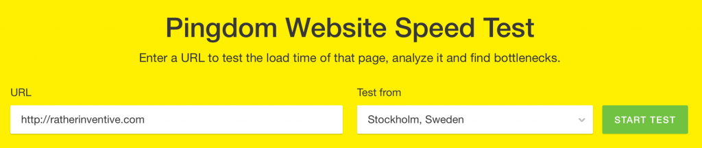
Test the speed of you website on Pingdom, you should be aiming for under 2 seconds.
Poor User eXperience (UX)
We expect a seamless experience when visiting a website. It has become a basic requirement across all platforms and devices, and a site that doesn’t conform to this standard doesn’t stand a chance.
If your website delivers good content and clear conversion opportunities you are maximising your chances of conversion – a recent study from Forrester Research showed that a user-friendly website could raise your conversion rate by up to a 200%.
If, however, you are trying to entice with over-the-top, eye-catching trashy content and/or inundating your visitors with newsletter sign-ups and in-your-face ads, you’re simply going to annoy more people than you attract.
Instead, avoid the garbage. Make the buttons tap-friendly by making sure all buttons, links and calls to action have the appropriate size and margin to prevent errors. Ensure users can tap-to-call. Use infographics and videos rather than reams of text to relay your message. Make it easy for users to navigate, read and tap on menu items.
You need to know your site works, and that all the functions work as designed, and you also need to make it easy for users to navigate and use your website. Otherwise, you might be inadvertently encouraging your customers to go elsewhere.
Your website is the way people buy your product or service, and this is becoming increasingly the case with more sales happening online than ever before. You have only seconds to influence your visitors so ensure that they are accessing a high-speed website, optimised for mobile use and that they are presented with an excellent user experience.
Make sure your customers don’t have to struggle to access or find your products or services, because with the highly competitive nature of eCommerce, your customers will not hesitate to go elsewhere if even the slightest headache arises, and this comes at a considerable cost to your business.
Image courtesy of Pixabay