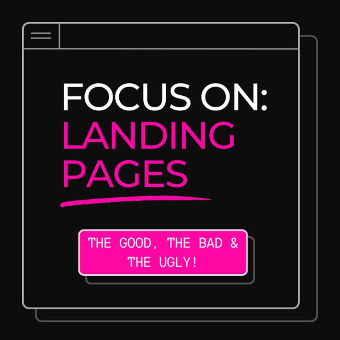
This month, we turn our focus to landing pages, dissecting their strengths and weaknesses. We review how easy they are to access, and navigate, and evaluate whether their designs are visually compelling.
Notes
We dive into the essentials of creating effective landing pages by analysing examples of both successful and poorly designed pages to provide actionable tips for converting visitors into customers.
Cruise
- Criticised for being too busy and overwhelming.
- Issues with small, unreadable text and fast-moving sliders.
- Excessive use of colors causing distraction and anxiety.
- Generally considered outdated and uncomfortable for users.
Air BnB
- Praised for a clean, visually appealing design.
- Simple and easy-to-use search box for planning trips.
- Multiple browsing options, including a map view.
- Positive user interface, though costs can be high.
LinkedIn Premium
- Described as plain and unengaging.
- Muted colors and tight line height make text hard to read.
- Lack of standout benefits and unclear messaging.
- Overloaded with text, making it less impactful.
Uber
- Commended for a calm, clear, and visually appealing layout.
- Effective use of a single, striking image and simple text.
- Clear call-to-action and easy-to-navigate interface.
- Balance of black and white color scheme enhances readability.
Spotify
- Homepage criticised for being dark and somewhat confusing.
- Assumption that most users already have an account.
- Small, hard-to-read text and murky images detract from user experience.
- Sign-up button is not prominent enough.
Netflix
- Consistently simple and effective landing page.
- Clear call-to-action with email sign-up at the top.
- Informative scrollable content explaining benefits.
- Consistent design that has proven successful over time.
Calm
- Emphasised simplicity and clarity in line with the brand’s ethos.
- Clean, spacious layout that promotes a calming experience.
- Effective use of video and funneling techniques to encourage app sign-up.
- Well-placed FAQs and engaging visuals.
Basecamp
- Basecamp’s landing page effectively uses a video to showcase its features and benefits, engaging visitors right from the start.
- It emphasises social proof with quotes from notable customers, building credibility and trust.
- The page is designed to guide users towards signing up with clear and compelling calls to action (CTAs).
- Has a playful approach to getting their core messsages across.
Hello Fresh
- Landing page highlights its unique selling proposition (USP) of making meal planning and cooking easy, saving time for busy individuals.
- The page uses vibrant visuals of meals and ingredients to appeal to visitors’ senses and emphasise quality.
- Clear CTAs and an easy sign-up process streamline the user journey, encouraging conversions.
- Is starting to feel a little dated compared to SunBasket, images feel more cluttered and less authentic.
Sun Basket
- Sun Basket’s landing page focuses on promoting its health-oriented and organic meal kits, targeting health-conscious consumers.
- It provides detailed information about the meal options, dietary preferences, and customisation, catering to diverse customer needs.
- The page features customer testimonials and reviews to build trust and showcase satisfaction, reinforcing the brand’s reliability.
- The font is a little fussy and hard to read in the headings
- Great use of colour and content spacing throughout the page
Key Takeaways for an Effective Landing Page:
- Maintain simplicity and avoid clutter.
- Use clear, readable text with sufficient contrast.
- Ensure visual elements enhance rather than distract.
- Provide a clear call-to-action and easy navigation.
- Focus on user experience to minimise anxiety and confusion.
- Highlight key benefits prominently to attract and retain users.