You may not realise it, but colour plays a vital role in marketing your brand. In this post, we delve into what brand colours say about a business and how you can use colour psychology to connect with your customers and drive sales.
“Colour branding is crucial across all industries, whether it’s the instantly recognisable Cadbury’s purple or Ferrari red. We ensure our branding is consistent … so that our machinery is easily identifiable to our customers.”
Selmach Machinery Ltd
Everywhere you look there are businesses exhibiting their brand colours. The chosen colours may seem random and casual, but a lot of work goes into it. No one knows better than two clients of ours Dave Hargest, Marketing Manager, at Selmach Machinery Ltd and Alex Coppock, Owner, Communion Architects, who tell us just how significant colour is in their marketing.
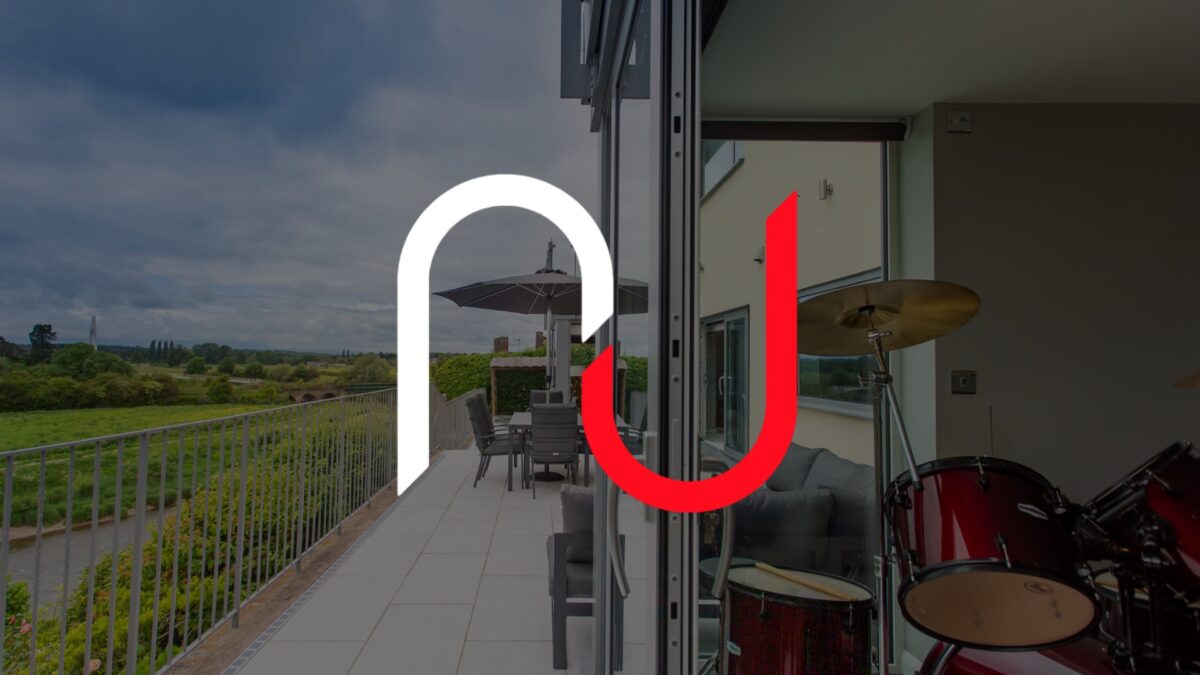
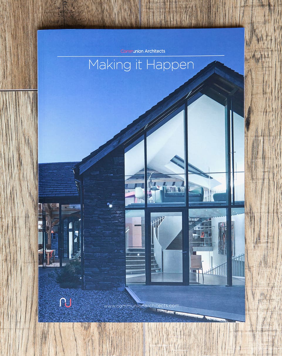
“At Communion we have 3 brand colours; red, black and white, (the white is used to give differentiation) which reflect the meaning of communion as a shared vision. It has an association with something special, sacred, the act of communion and the Christian faith.“
Communion Architects
Brand colour psychology works on the basis that different colours evoke different emotions and responses in customers. For example, red is often associated with passion, excitement, and energy and can encourage customers to make quick decisions. On the other hand, blue is often associated with trust, dependability, and stability and can be used to build confidence in a brand. These colour associations influence consumer behaviour and decision-making, which can impact their purchasing decisions. Dave shared: “Many appreciate the aesthetics of their machinery, ensuring it looks as good as it performs. For these customers, the branding—and, by extension, the colour of our machinery—plays a crucial role.”
According to research, using specific brand colours can increase brand recognition by up to 80%. Customers who see a familiar colour, are more likely to recognise the brand and associate it with a specific product or service. Colours can elicit a particular emotional response, affect us in many ways, and drive our decision making; You see red in the distance and you think of MacDonald’s, Canon or Coca-Cola. Or you see green, and you could be looking at BP or Starbucks. This association we create in our minds, to a particular brand, results from the consistent and effective use of colour in its branding and marketing.
Colour, then, is an important factor for creating a strong recognisable brand, and by giving it due consideration you can give your business a distinct competitive advantage.
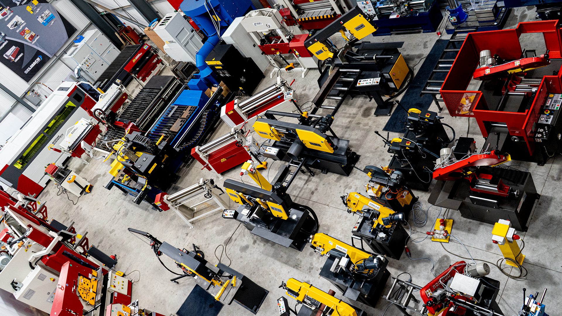
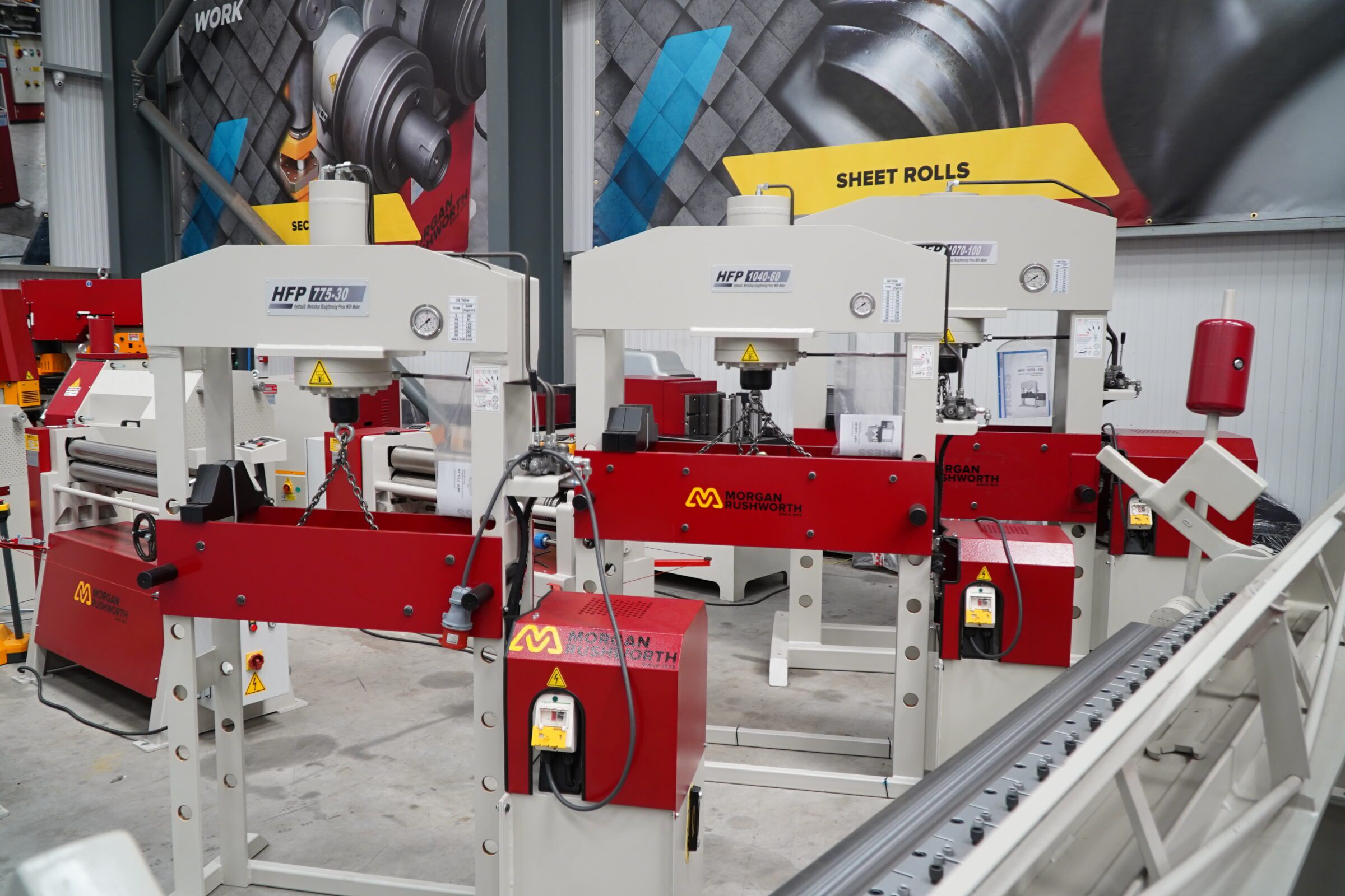
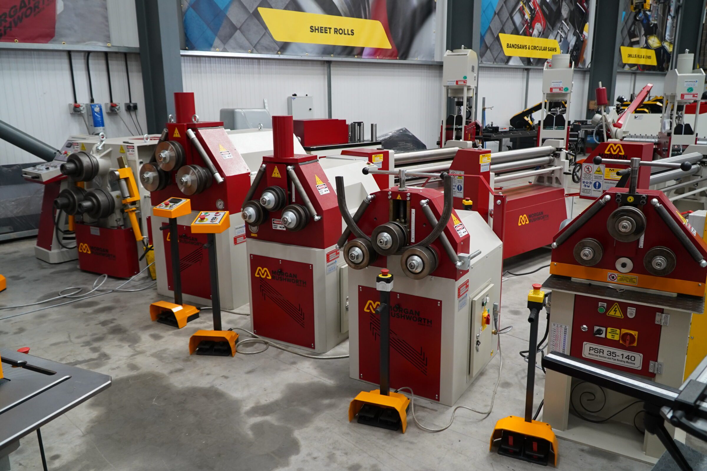
“The distinct colours of our Morgan Rushworth and Sterling machines make them stand out in any workshop. This visibility not only makes our machinery easier to locate and identify but also conveys a sense of reliability and quality. When potential customers see our machinery in action, the strong branding can influence their purchasing decisions, giving us an edge over competitors whose brands might not be as visually prominent.” Selmach.

The psychological impact of colour
By understanding the psychological effects of different colours, your business can strategically incorporate them into your branding to influence consumer behaviour.
Selmach understands and leverages these psychological impacts by using colour in their machinery to create a stronger connection with their customers and enhance their brand loyalty.
“Colours can evoke specific emotions and responses, so selecting the right colours for our machinery is not just about aesthetics but also about influencing customer perceptions. Red, for example, is often associated with energy, strength, and power, which complements the robust performance of our Morgan Rushworth machinery. Yellow, used in both Morgan Rushworth and Sterling brands, conveys optimism, clarity, and warmth, making our machines eye-catching and positively perceived.
Our main brand, Morgan Rushworth, utilises a striking combination of red and yellow with a neutral grey, making our machinery distinctively recognisable in any workshop. Another of our brands, Sterling, features a range of saws in vivid yellow. When customers purchase multiple machines from us, this cohesive colour scheme creates an impressive visual impact and reinforces our branding.
Consequently, when these customers consider their next machinery purchase, the desire for aesthetic consistency increases the likelihood of choosing our products again.
Several customers over the years have highly valued the importance of branding and colour, even going so far as to pay extra to have their machines painted in their own company colours. This ensures their entire workshop remains on brand, reflecting their corporate identity.“
Communion Architects’ use of two strong colours to represent what their brand stands for: resurrection, transformation and life.
“The red and the black represent life and death, two powerfully contrasting colours. Strong colours that speak of life, transformation and resurrection. They’re also accent colours, the red ‘jumps out at you’, and significantly we’ve chosen to use a deep, blood red shade to further the association.
We wanted to convey something of substance and real value, a quality experience and product. What you receive from Communion is a service that realises the significance within our clients projects.“

Repetition of brand colours
One important aspect of colour branding is its consistency across different aspects of marketing: the logo, website, packaging, advertisements, shopfront, in-store design, etc. Your audience remembers your brand mainly by its colour, so make sure it’s the same colour everywhere to strengthen your brand’s recognition and awareness in the eyes of your customers.
This uniformity helps create a cohesive brand experience that reinforces brand identity. “Consistency in branding extends beyond the machinery itself. At Selmach, we ensure that our branding colours are consistently applied across all touchpoints, including our website, brochures, and customer service materials. When customers encounter our brand colours in different contexts, it reinforces their association with our high-quality machinery and reliable service.“
How to choose your brand colours
When picking your brand colours there are several things to consider. First, think about your brand identity and personality. If, for example, you’re a health and wellness brand, you’ll want to focus on calming colours associated with nature and health like pale blues and greens.
Then you must know your target audience, who they are and what they care about. If they want cheap and cheerful, the primary colours will likely appeal to this type. If, on the other hand, they are a high-quality brand type of people, then muted colours or blacks and greys, like Chanel or Mercedes-Benz, would best reflect the type of people you’re trying to sell to.
This is where good market research comes in, as it enables you to understand your target audience and their preferences. Also, our colour perceptions and meanings differ depending on age, social class, gender, religion and cultural and regional differences, so ensure you consider these factors when selecting your brand’s color palette
Choosing multiple colours in your branding
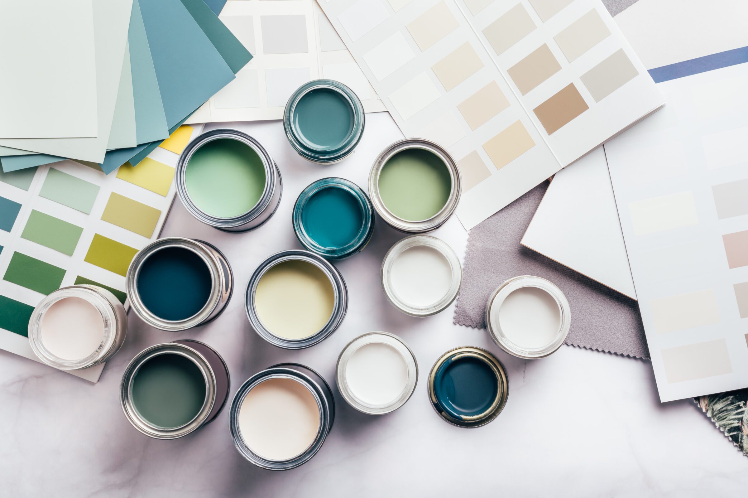
Of course, many brands don’t use just one colour in their branding; they use multiples. By using a palette of colours, you can prevent your branding from being too flat. However, you can’t just throw a few random colours together. When choosing multiple colours, you’ll need to consider a base, accent and neutral colour.
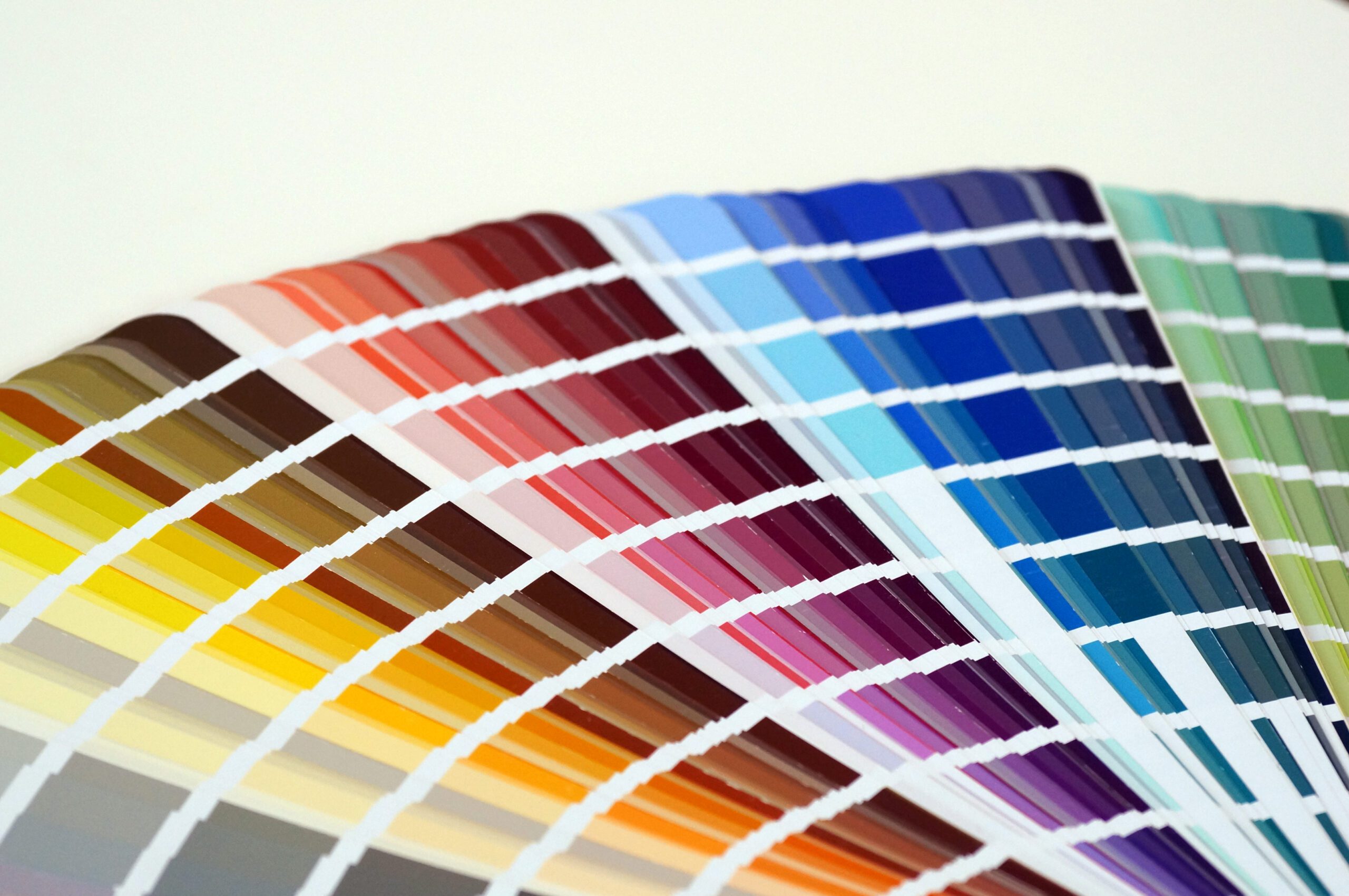
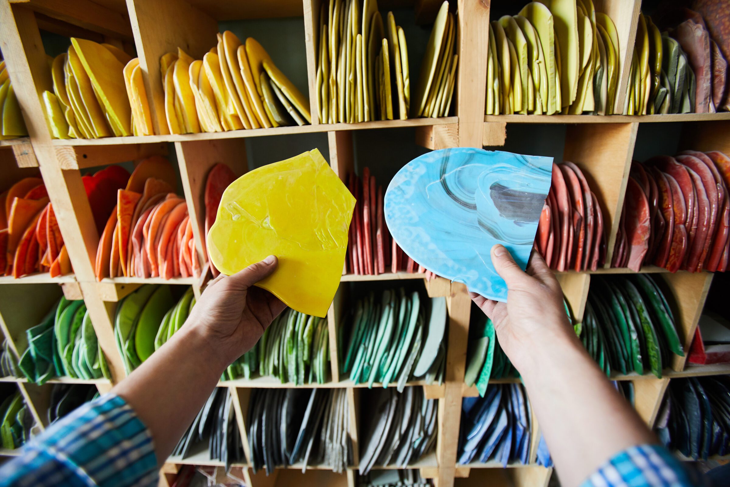
The colour wheel can help you to get a visual understanding of colours and how to arrange them according to their chromatic relationship. It will help you to choose aesthetically-pleasing colours that accurately represent your type of business. So, if you want to convey a sense of sophistication and luxury, you might choose several colours from the cool side of the colour wheel, such as blue or purple. If you want to convey warmth and approachability, you might choose from the warm side – red or yellow, for example, as with Communion. “Using red in our branding … we seek to reach out, be accessible and helpful, explain complex things well and take clients through what will be a very significant and transformational journey.“
There are hundreds of examples of the colour wheel online and various tools, such as the free design tool Coolors, to help you come up with the best combination of colours, but as a rule, use one of these types of colour palettes:
Analogous: Colours next to each other
Complementary: Opposite colours
Monochromatic: Different shades or tones of the same primary colour.
Using the wrong colours

Without due consideration for your target audience’s preferences and without considering colours that align with your brand values and message, you could be hurting your business in several ways. It can make your products and marketing materials less visually appealing, making it less likely that customers will be interested in purchasing them. It can also create confusion or misunderstandings about the brand, making it difficult for customers to understand what the brand stands for. Neither of which is good for business.
Another mistake is choosing colours that are similar to your competitors’. Differentiate from competitors, and you will create a unique and distinctive brand identity that sets you apart.
One more thing to note before you get creative – while choosing the right colours is important, you’ll want to avoid using too many colours as this can be overwhelming and confusing for your customers.
Conclusion
The two successful businesses we have spoken to clearly demonstrate the thought processes and impact that due consideration for colour has on their success. Choosing the colours that best reflect your business’s ethos and products can have a significant impact on consumer behaviour and decision-making and by understanding the psychological effects of different colours you can create a unique and recognisable brand identity that resonates with your target audience.
Image Credit: Feature Image Colour Swatch by StiahailoAnastasiia, Envato Elements | Machinery Images by Selmach Machinery